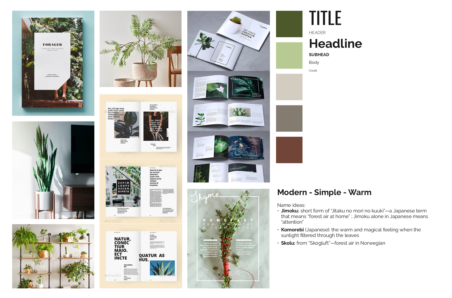
Jimoku Magazine is designed for young adults who want to enhance their quality of life by bringing nature into their living space. The design choices reflect the cozy and simple environment that the target group is interested in.
Jimoku is a short form of “Jitaku no mori no kuuki”—a Japanese term that means “forest air at home”. The name evokes a calming and peaceful feeling when people can bring nature into their living space.
MOOD BOARD
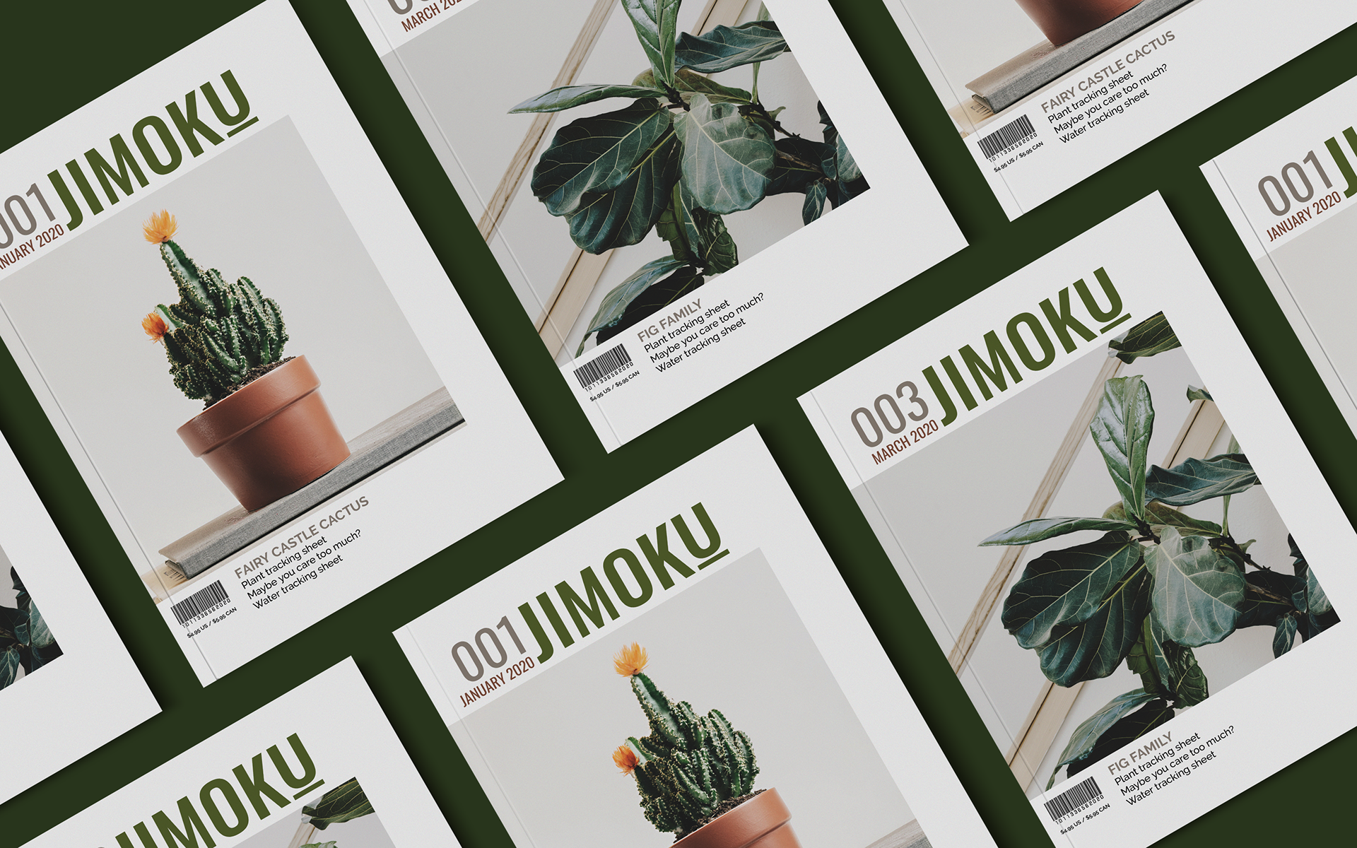
NAMEPLATE DESIGN
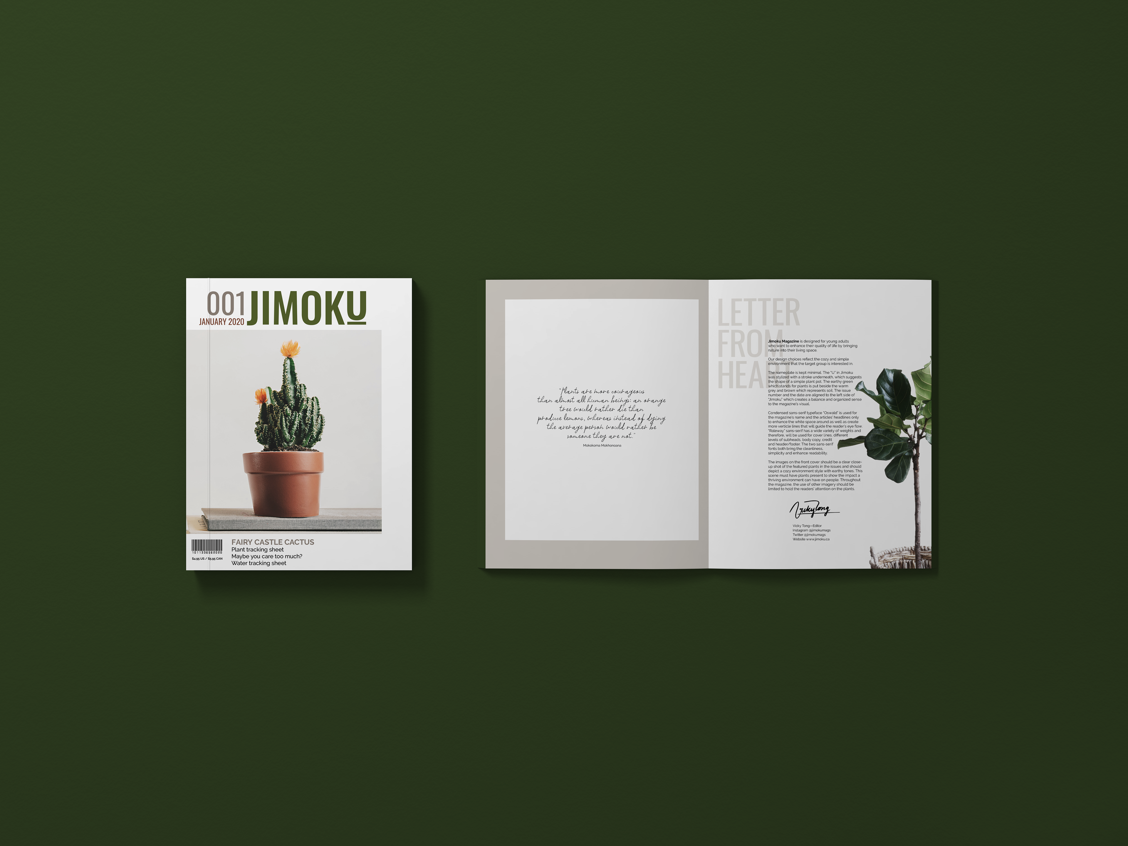
The nameplate is kept minimal. The “U” in Jimoku was stylized with a stripe underneath, which suggests the shape of a simple plant pot. The earthy green which stands for plants is put beside the warm grey and brown which represents soil. The issue number and the date are aligned to the left side of “Jimoku” which creates a balance and organized sense to the magazine’s visual.

COLOUR PALETTE
The earthy neutral tones of green and brown taken from plants’ colors bring the warm and calming feeling to the magazine.

TYPOGRAPHY CHOICE
The two sans-serif fonts both bring the cleanliness, simplicity and enhance readability.

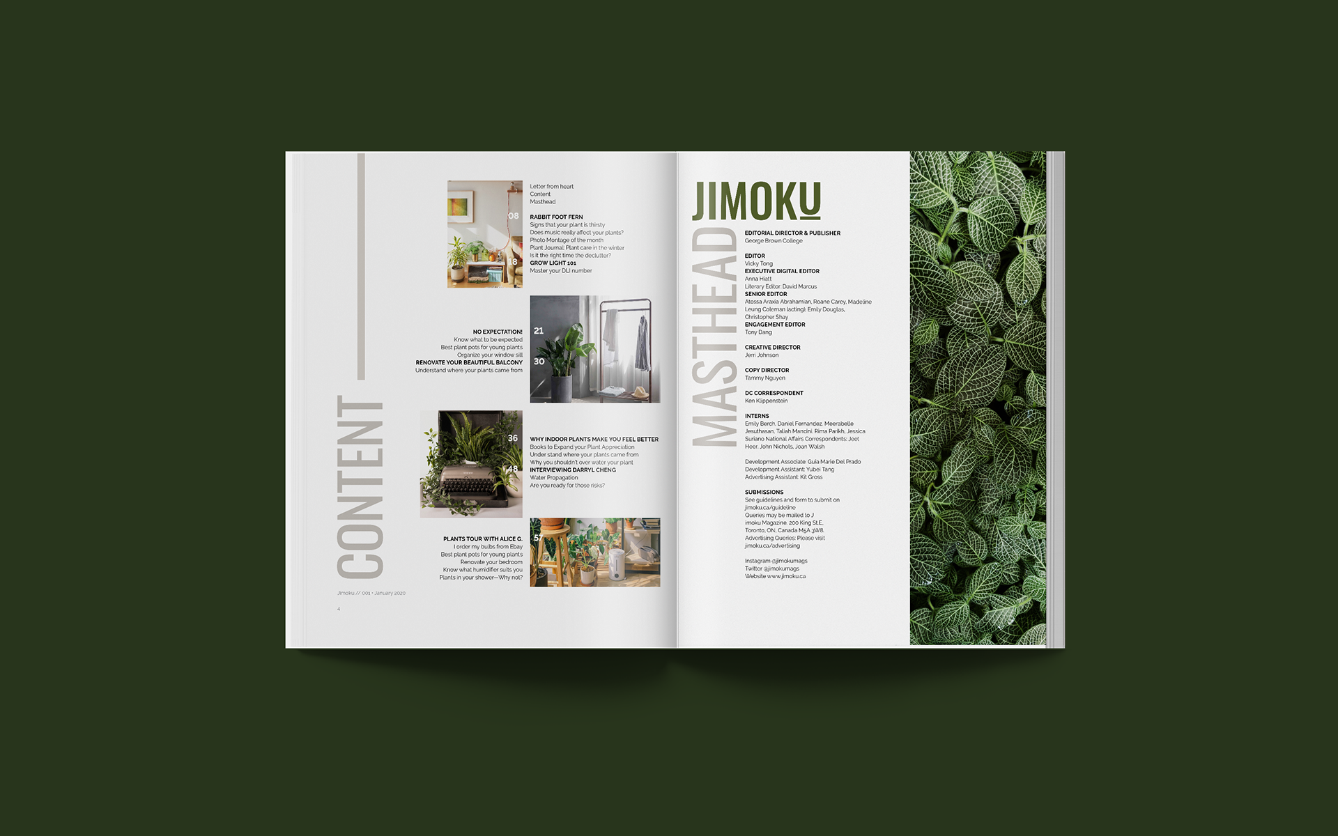
REGULAR ARTICLE SPREAD
Source of article
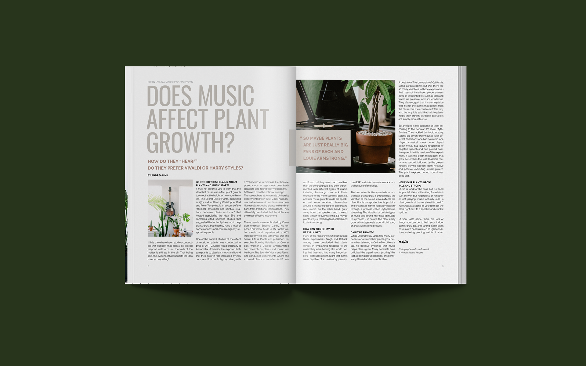
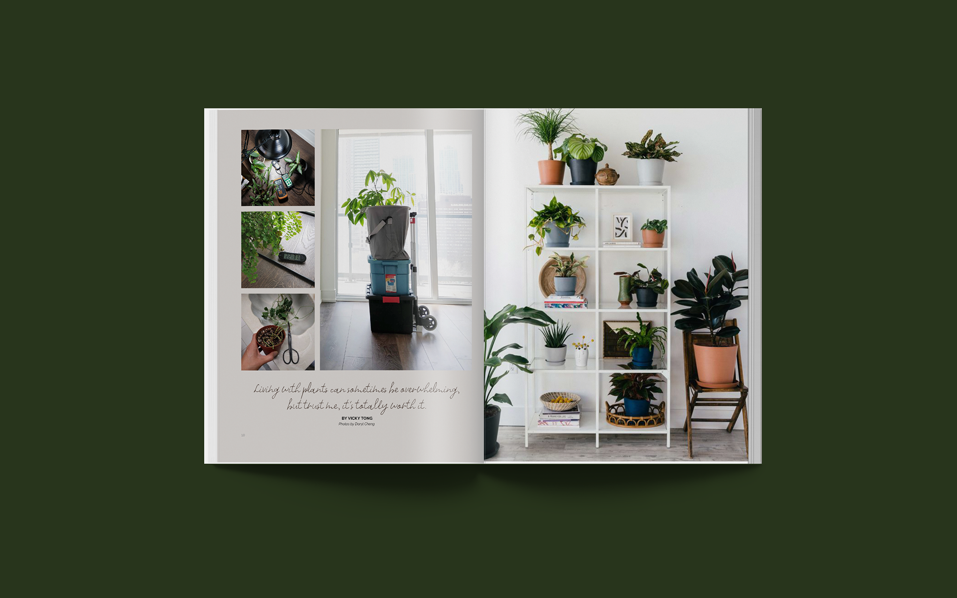
PHOTO JOURNAL
Photo journal spread was inspired by Daryl Cheng's House Plant Journal.
The photos on the left page was taken from his blog.
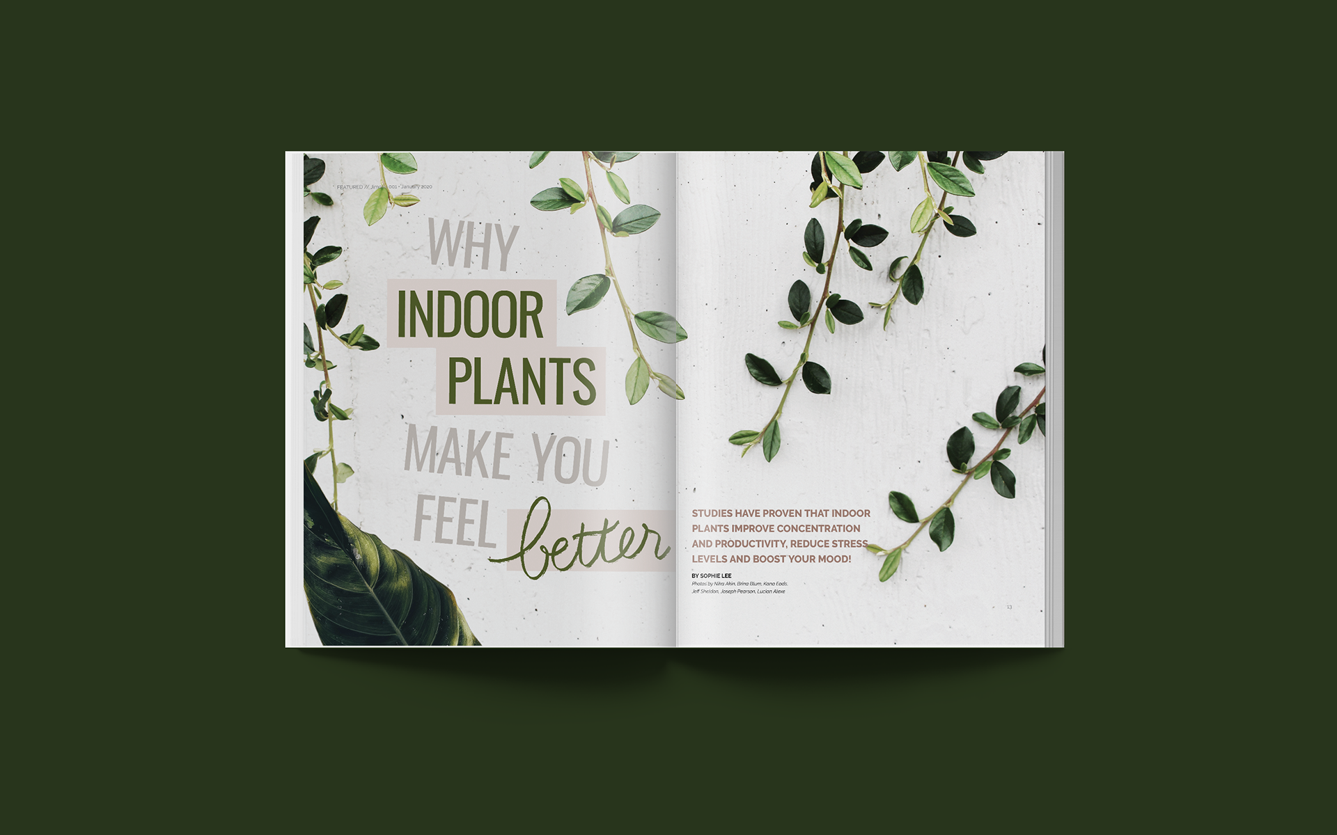
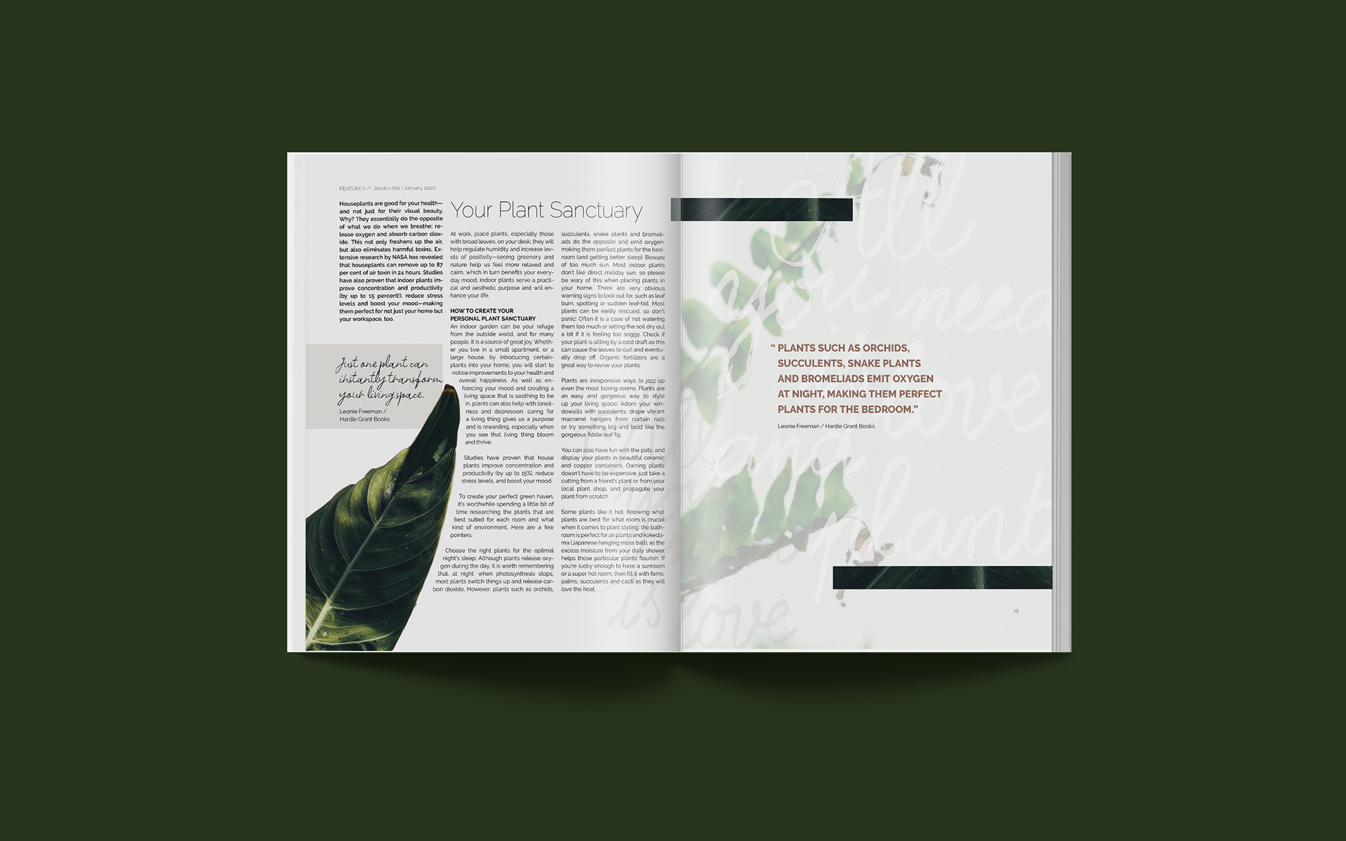
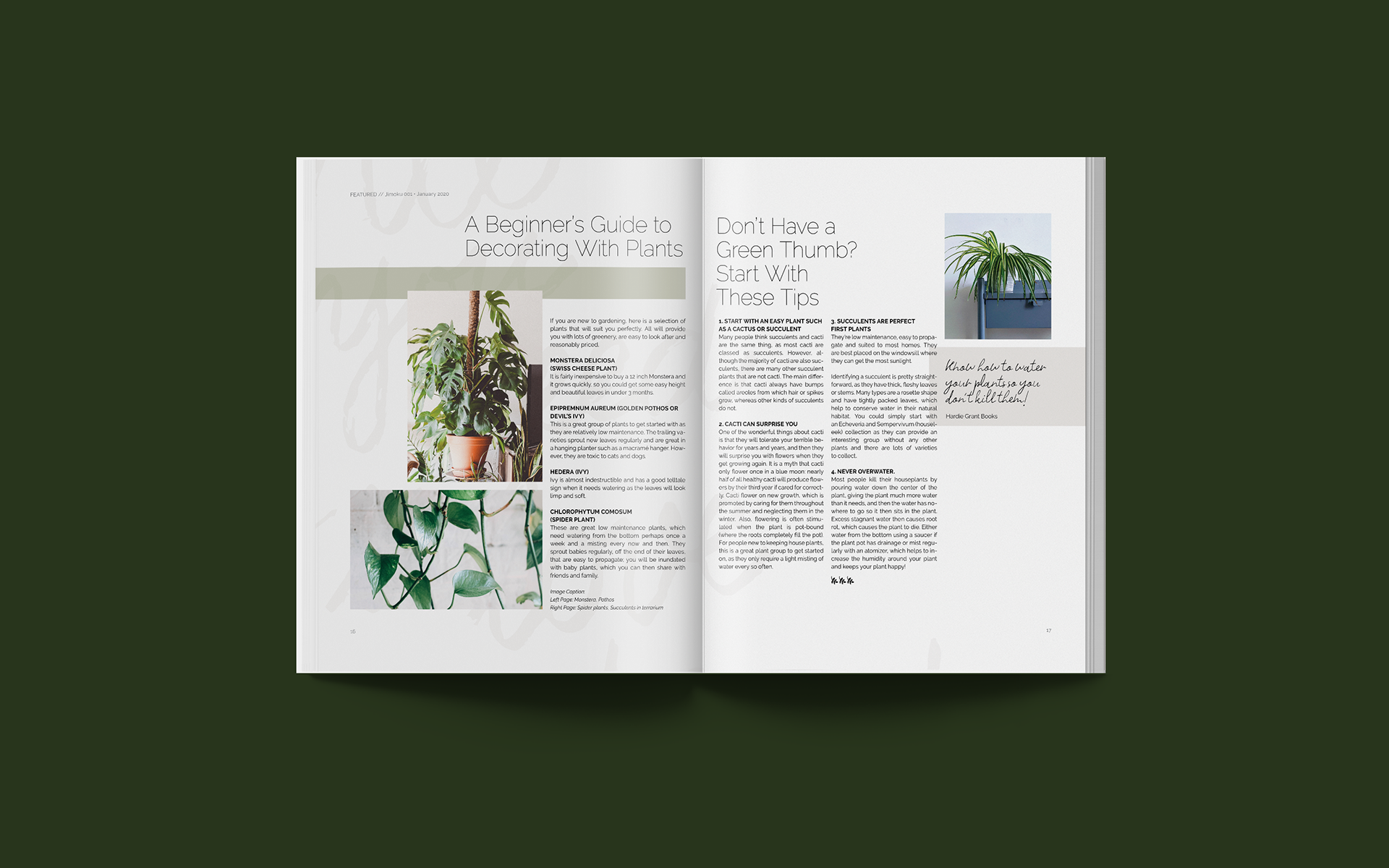
FEATURED ARTICLE SPREADS
Application used: Indesign, Illustrator
Vicky Tong Design. April 2020